WillInMotion - A Figma Project
Summary:
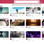
This was a piece to test my understanding of user-centric design, an exercise of identifying what contributes towards an easy to use video hosting platform, and how to best utilise space on a screen efficiently.
I began with a blank canvas, working within 1920 x 1080 frames, then moved to analysing and identifying key features and components seen on popular streaming and video services such as Twitch and Youtube. Once I had this in mind, I created a list of the key pages that I would need to plan and prepare for.
This included:
- Home Page
- Registration/Signup Page(s)
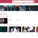
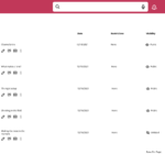
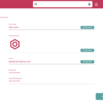
- Account Page
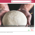
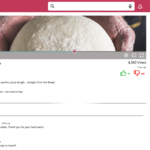
- Video Page (with comment section)
- Settings Page
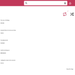
- Playlist view
- “My Uploads” page
Once I had this in mind, I then moved to font and colour pallet choices, as I wanted to make something which felt warmer. I used a ‘Watermelon’ shade of magenta and a toned down cyan/turquoise to have a contrast, while using a bone colour to add a neutral shade in between. After this was all considered, I began to create suitably sized components that would make the basis of the search/side menu bars.
Once those dimensions were considered, I next started to build the home and video pages, before returning to the list of important pages I had made before.
Overall, I am happy with the outcome, as I was able to set a new personal record regarding the time it took to create such a project from initial drafting to the final adjustments.
*All Images were sourced using Upsplash

