Summary:
This was one of my larger exercises using Figma. The plan was to expand upon what I was working on and apply it to a real world concept. This ended up being an Uber Eats Styled website.
It was a process of finding the key sections of the app, and asking myself how they were connected. “If I have a front page, then that means I have to have some form of featured section, and a “Deal” carousel in order to look through the different restaurants. Now I need to think of how to improve the readability on the next page and show that keywords are being considered…”
This process continued until I had the following:
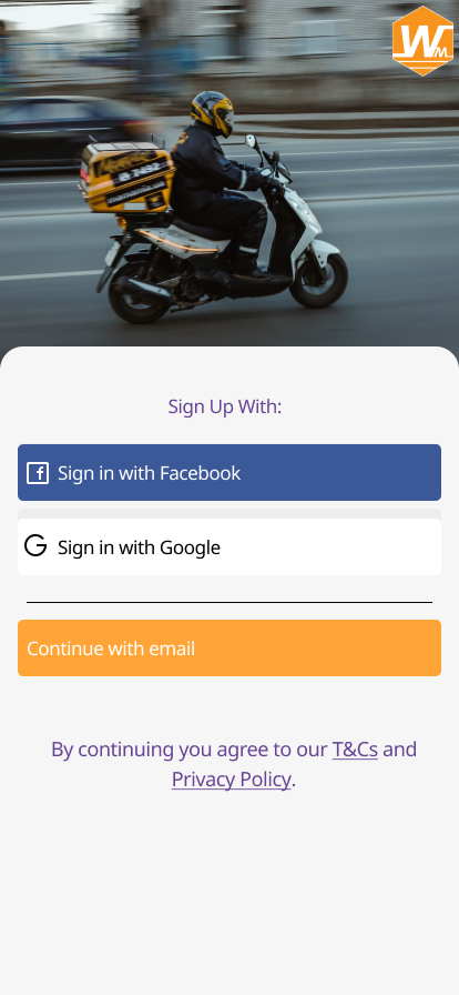
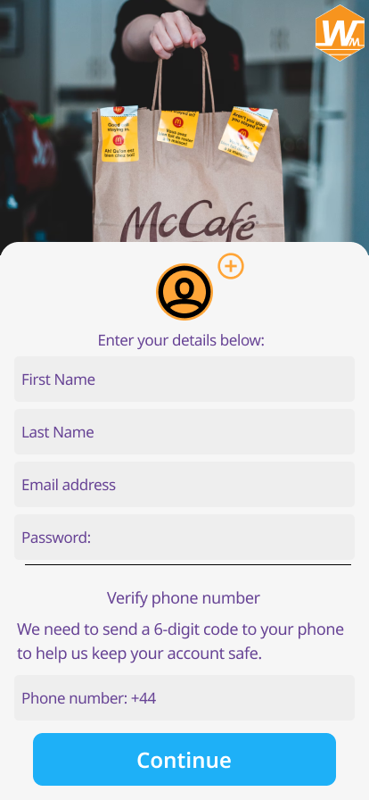
- Signup/registration page
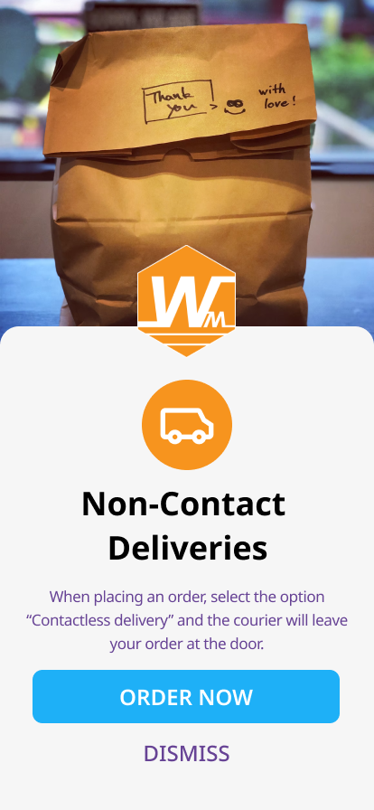
- “Contact Free” delivery Page
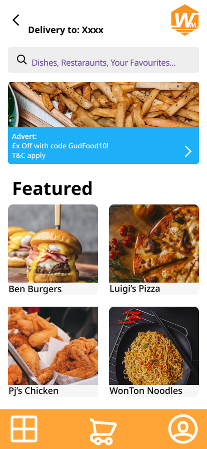
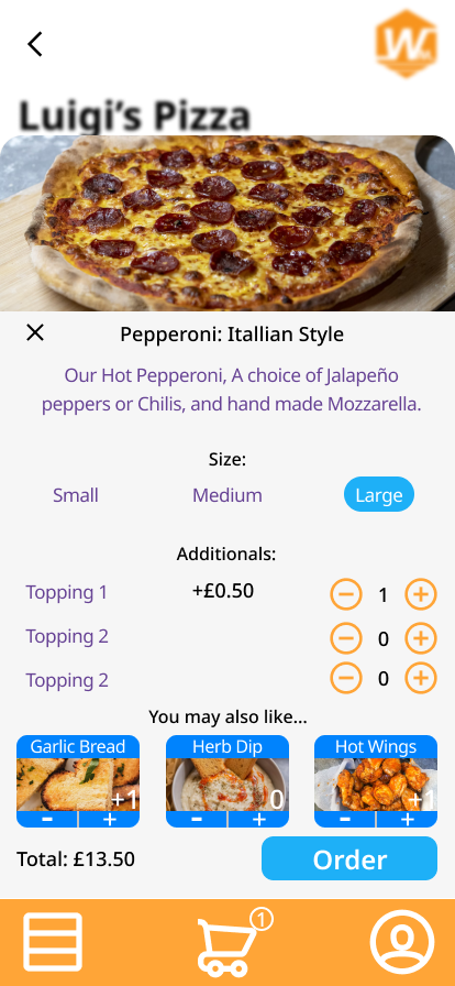
- Featured/Main Menu page
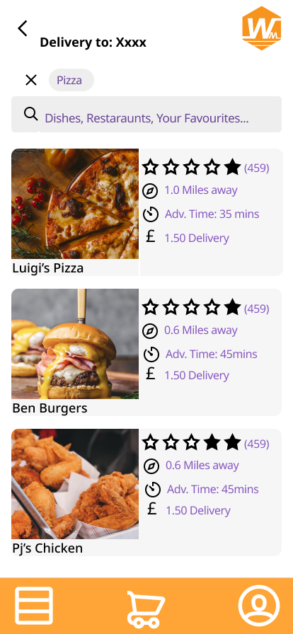
- Search Page
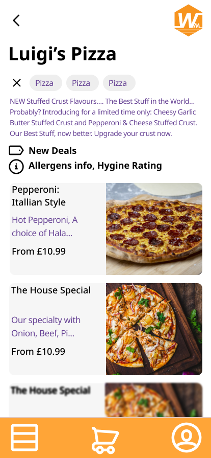
- Restaurant Page
- Item (and additonals) popup
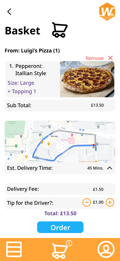
- Basket page
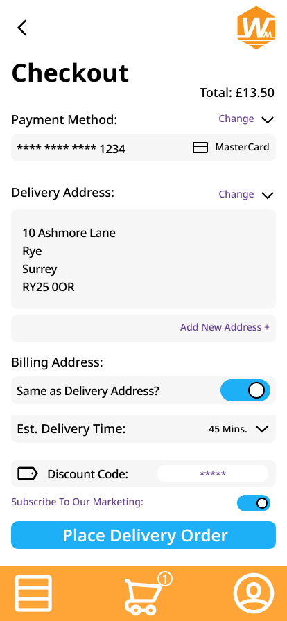
- Checkout
Once I had this structure and understanding, I used adobe color in order to create a suitable pallet. Using Adobe Color, I selected an orange that wasn’t too bright and, with the pallets I could generate, found a compliment blue. This would be a theme to follow later on.
Another thought regarding the orange was it’s link to food. Orange, Golden Brown, autumn tones, the shades of orange can be linked with a variety of foods typically bought from fast food sites (Burgers, Fried Chicken, Pizza). Whilst orange is also used in displaying caution, or a warning, it’s also a colour that brings warmth and isn’t as harsh as red.
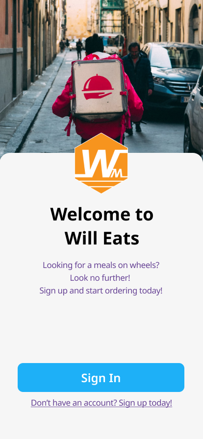
Looking at how to display the front page, I took inspiration from Deliveroo and Ubereats. Using a van and a “To Go” bag to display to the user that this was an online take-away app and to give a warm reception. They both establish an offer and a discount screen below a search bar, these typically are discounts or advertisements for restaurants or established brands with a significant presence on the service. This advert would then take them to a seperate page where they can either activate it at the checkout, or review the offer before applying it. Following that, you would have a selection of “Featured” restaurants. These would be ones that either are a well known brand (McDonalds, Burger King, KFC, etc.) or are the highest reviewed within the delivery range of the user. There’s also an option to choose between a list view, or a Larger thumbnail view on the bottom left of the lower menu.
Overall. I’m happy with the outcome and the time it took with this project, as it was an eye opening experiance.
*All Images were sourced using Upsplash